In the previous chapter I described how to import the needed data to Pandas DataFrames, and how to manipulate DataFrame object. Now lets take a look on how we can visualize that data in a plot form. This is by no means a proper analysis of the suicide rates. It is a plotting example.
Below are the necessary imports. ‘%matplotlib inline’ is IPython-specific directive which displays matplotlib plots in notebook. It can be removed and plt.show() can be added to the end of the code to display the plot. We are also importing numpy, pandas, matplotlib.pyplot for plotting, and separately matplotlib to work on specific matplotlib functions if needed.
%matplotlib inline
import numpy as np
import pandas as pd
import matplotlib.pyplot as plt
import matplotlib as mpl
Next step is to import our data and assign it to DataFrame. We created that table in the previous example.
table = pd.read_excel('mergedData.xlsx')
table.head()
We can create some variables to make our code easier to work with. In this tutorial I am planning to create a plot of Countries on x axis, and Suicide/Death % on y axis.
x = table.index
y = table['suiPerDeath']
size = table['deaPerPop']
tLabels = table['Country']
yMax = round(y.max()) + 1
xMax = x.max() + 1
lightBlack = '#3e3e3e'
Let’s start by creating fig, and ax objects, defining the figure size and background color. We create a scatter plot by using x, and y variables defined earlier. The size of the circles are defined by Death/Population %. Alpha is set at 0.6 for the visibility of overlapping circles.
fig, ax = plt.subplots(figsize=(10, 4), dpi=200, facecolor='white')

im = ax.scatter(x, y, s=size * 30, alpha=0.6, linewidth='0.2', edgecolor=lightBlack)
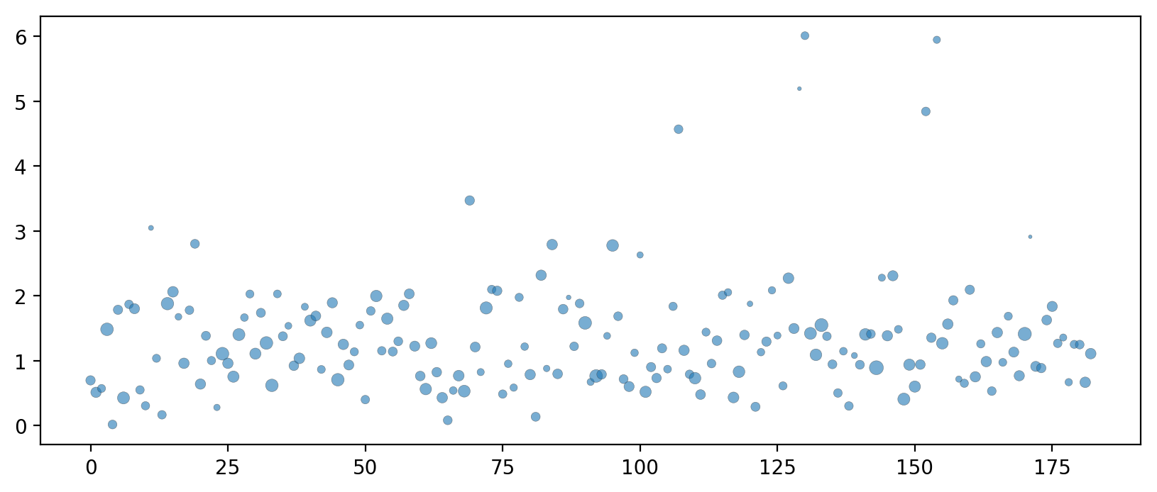
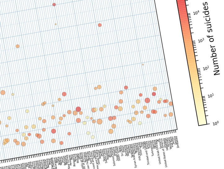
It is a plot, but it doesn’t provide us any useful information. We can introduce color and colorbar to the plot to make it readable. Also we can adjust plot limits, and add labels to the x axis.
fig, ax = plt.subplots(figsize=(10, 4), dpi=200, facecolor='white')

im = ax.scatter(x, y, s=size * 30, c=table['2010_s'] * table['2013_p'] / 100,
                norm=mpl.colors.LogNorm(), cmap='YlOrRd', alpha=0.6,
                linewidth='0.2', edgecolor=lightBlack, label='_nolegend_')

ax.set(xlim=[-1,xMax], ylim=[0, yMax], xticks=x)
im.set_clim(vmin=1, vmax=1000000)

# We can add labels to the x and y axes
ax.set_xlabel('Country list', fontsize=8)
ax.set_ylabel('Suicide per Death %', fontsize=8)

# Custom added plot title using 'ax.text' function
ax.text(0.5, 1.04, 'Suicide per Death % by Country', horizontalalignment='center',fontsize=14,
        color=lightBlack, transform = ax.transAxes)

# Setting x tick labels to the country list.
ax.set_xticklabels(tLabels, rotation='vertical', size=3)

# Adding colorbar and adjusting some parameters.
cbar = fig.colorbar(im, label='Number of suicides')
cbar.ax.tick_params(color=lightBlack, labelsize=5);
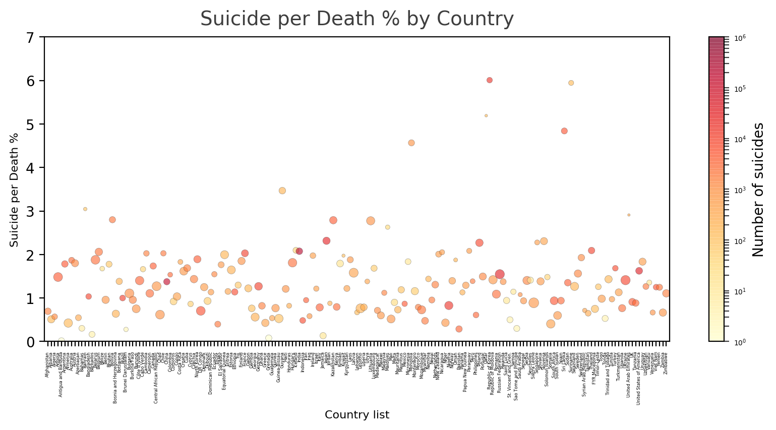
Now that the plot is more readable, we can add ticks to it. Also we are going to add a plot legend.
fig, ax = plt.subplots(figsize=(10, 4), dpi=200, facecolor='white')

im = ax.scatter(x, y, s=size * 30, c=table['2010_s'] * table['2013_p'] / 100,
                norm=mpl.colors.LogNorm(), cmap='YlOrRd', alpha=0.6,
                linewidth='0.2', edgecolor=lightBlack, label='_nolegend_')

ax.set(xlim=[-1,xMax], ylim=[0, yMax], xticks=x)
im.set_clim(vmin=1, vmax=1000000)

# We can add labels to the x and y axes
ax.set_xlabel('Country list', fontsize=8)
ax.set_ylabel('Suicide per Death %', fontsize=8)

# Custom added plot title using 'ax.text' function
ax.text(0.5, 1.04, 'Suicide per Death % by Country', horizontalalignment='center',fontsize=14,
        color=lightBlack, transform = ax.transAxes)

# Setting x tick labels to the country list.
ax.set_xticklabels(tLabels, rotation='vertical', size=3)

# Adding colorbar and adjusting some parameters.
cbar = fig.colorbar(im, label='Number of suicides')
cbar.ax.tick_params(color=lightBlack, labelsize=5);

# Defining color of the ticks, and adjusting tick label size on y axis
ax.tick_params(color=lightBlack)
ax.yaxis.set_tick_params(labelsize=6)

# Adding minor ticks to the y axis
ax.set_yticks(np.arange(0.5, yMax, 1), minor=True)

# Adjusting color of all spines.
for sp in ax.get_children():
    if isinstance(sp, mpl.spines.Spine):
        sp.set_color(lightBlack)

# Adjusting colors, line parameters of the major and minor grid
minParm = dict(which='minor',color='steelblue', linestyle='-', linewidth=0.2, alpha=0.3)
ax.yaxis.grid(True, **minParm)
majParm = dict(which='major',color='steelblue', linestyle='-', linewidth=0.3, alpha=0.5)
ax.xaxis.grid(True, **majParm)
ax.yaxis.grid(True, **majParm)

# Adding extra tick lines every 10 ticks as a numpy array
extrTicks = np.arange(0, table.index.max(), 10).tolist()
plt.xticks(list(plt.xticks()[0]) + extrTicks)

# Here we are creating a new scatter plot to show it on the custom legend object.
for area in [0.5, 1, 2]:
    plt.scatter([], [], c='steelblue', alpha=0.6, s=area * 30, linewidth='0.2', edgecolor=lightBlack,
                label=str(area) + ' %')
pst = plt.legend(loc='upper left', scatterpoints=1, frameon=True,
           fontsize='6',labelspacing=0.5, title='Death per Population %')
pst.get_frame().set_edgecolor(lightBlack)
pst.get_title().set_fontsize('6');

The plot now can be saved to the file. Using ‘bbox_inches=’tight’ function will remove unnecessary blank spaces and save the image as we see it.
fig.savefig("SuiPerDeaPerCount.png", bbox_inches='tight')
Looking at all the data provided, we can conclude that mostly suicides are in range 1-2% from total death. Countries like China and India have lower suicide rates even though overall amount of suicides compared to the rest of the countries are higher. Death % to population wise Sierra-Leone, Russia, Ukraine, CAR, and Congo are close to 2%. On top of the chart, surprisingly, is South Korea, with about 6% suicide % to death rates, even though death % to population is lower.
Downloadable content:
mergedData.xlsx
More on Matplotlib Visualization can be found on github page by Jake VanderPlas. His book is available in Jupyter Notebook format