Visualization is the key to understanding the data. Lines of endless data can be overwhelming. Most of the times, to reach the conclusion, it is better to visualize the task. D3.js is a JavaScript library that is used for data visualization using the web standards like HTML, CSS, and SVG. Since the initial release in 2011, D3 gained popularity pretty quickly due to dynamic, interactive data visualizations capabilities in the browser. There is a huge community of followers of D3, and it is supported and improved by its creator Mike Bostock constantly.
Lately I’ve been working on D3. There is definitely a lot to learn, a lot to gain and improve. This blog post is a quick summary of knowledge that I gained in the last few weeks playing with D3. Initially I started looking for tutorials, and books on the subject. To be honest I’ve got a bit frustrated due to the lack of detailed material on the subject. I found “D3.js Essential Training for Data Scientists” on Lynda.com that guided me in the right direction. I discovered for myself https://bl.ocks.org/, and since then I started checking different types of visualization provided on that website. My way of learning is to think about a problem/case that might interest me, see if there is any solution available, if not then divide the problem into smaller tasks, and work on them one by one.
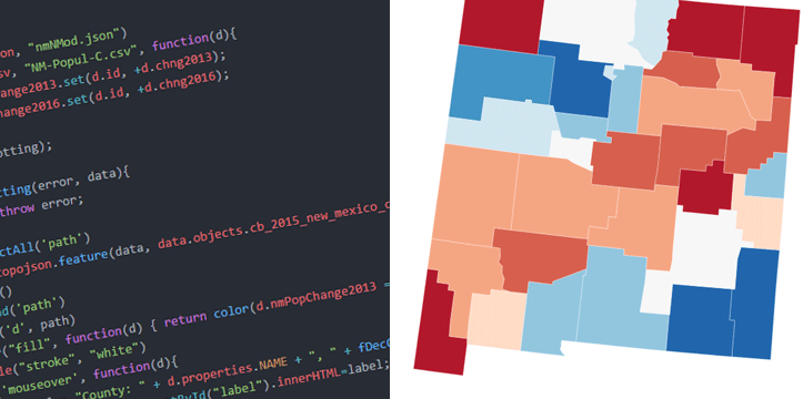
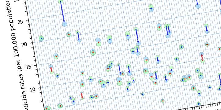
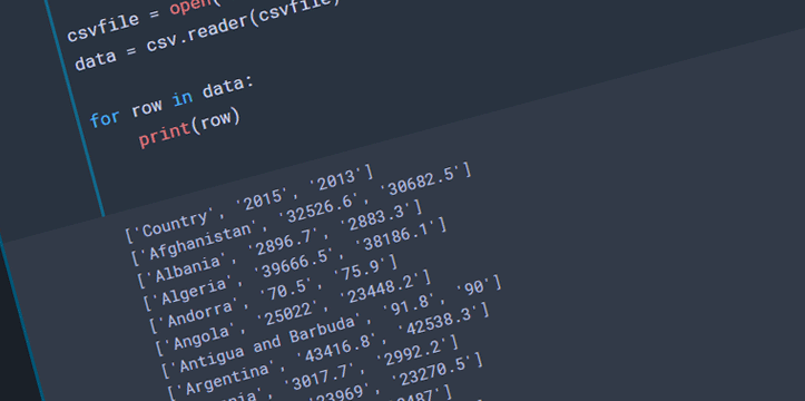
Let’s look at few examples below. I am working on New Mexico data for this blog post. The data was gathered through US Census Bureau, and US Department of Labor websites. Disclaimer: this is not a complete analysis of the data; data is used for visualization purposes only, all the data is available for public on the above mentioned websites. I will be working on a few tutorials in the next few weeks, explaining the below examples in bigger detail.


