Browsing Tag

matplotlib

b15
Python,

Plotting Error Bars in Python using Matplotlib and Numpy Random

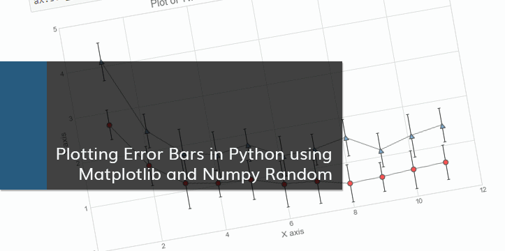
A friend of mine needed help with plotting clusters with corresponding asymmetrical error bars. I decided to write a blog post about plotting error bars in Python after helping with the problem. The notebook can be also viewed on Github.

Error Bars

Error bars are graphical representations of the error or uncertainty in data, and they assist correct interpretation. For scientific purposes, reporting of errors is crucial in understanding the given data. Mostly error bars represent range and standard deviation of a dataset. They can help visualize how the data is spread around the mean value.

The Data

The data shown below is randomly generated for plotting purposes. This blog post is not about correct statistical interpretation of error bars, and solely written for demonstration purposes.

We will be using numpy for data generation. Let’s start by importing numpy.

In [1]:
# Importing numpy
import numpy as np
np.__version__
Out[1]:
'1.14.0'
b13
Deep Learning, Machine Learning, Python,

Basic Example of a Neural Network with TensorFlow and Keras

This blog post covers basic example of a Neural Network, using TensorFlow and Keras in Python. The notebook can be also viewed on Github.

TensorFlow and Keras

TensorFlow was developed at Google to use internally for machine learning tasks, and applied to the applications like speech recognition, Search, Gmail, etc. It was made public in 2015 as an open source application. The library is in C++, used with Python API. TensorFlow can be used for various problems like image recognition, language processing, implementation in self-driving cars, etc. There are various alternatives available to TensorFlow such as Theano, and Torch.

We are going to use Keras in this notebook, with Tensorflow as a backend engine. Keras is a high-level wrapper, which can be used both with TensorFlow and Theano. It simplifies common operations. The code is similar to scikit-learn, making it easier to get used to it, while in the background TensorFlow or Theano is used for processing.

The data

In this example we will be looking at MNIST database (a subset of a larger set by National Institute of Standards and Technology). This is a classic dataset containing 60000 training images, 10000 test images, and corresponding training and test labels. The images are handwritten digits, in the shape of 28 x 28 pixels, and divided into 10 categories (from 0 to 9).

The versions

In this example I am using Keras v.2.1.4 and TensorFlow v.1.5.0 with GPU (using NVIDIA CUDA). Running examples on a GPU can speed up the training process.

In [1]:
# To avoid warnings
import warnings
warnings.filterwarnings('ignore')

# Importing keras and tensorflow, and printing the versions
import keras
print('Keras: {}'.format(keras.__version__))

import tensorflow as tf
print('TensorFlow: {}'.format(tf.__version__))
Using TensorFlow backend.
Keras: 2.1.4
TensorFlow: 1.5.0
b11
Machine Learning, Python,

Statistical Terms in Data Science and Regression Metrics

Various statistical concepts are incorporated in Data Science. In this notebook I am going to cover some basic statistical terms, and talk about metrics used in Data Science for Regression tasks. This notebook can be also viewed on Github.

1. Statistical terms

Let’s look at some simple statistical terms in detail:

Mean (\bar{x} ): Averaging. Mean is a sum of all values divided by the number of values:

\bar{x} = \frac{\sum_{i=1}^{n}x_i}{n}

Variance (\sigma^2 ): Describes the spread of a distribution. For a set of values, the variance:

\sigma^2 = \frac{1}{n}\sum_{i=1}^{n}\big(x_i - \bar{x}\big)^2

Standard Deviation (\sigma ): Square root of variance, is in the units of the data it represents:

\sigma = \sqrt{\frac{1}{n}\sum_{i=1}^{n}\big(x_i - \bar{x}\big)^2}

b9
Machine Learning, Python,

Machine Learning – Programming Exercise 2: Logistic Regression

Programming Exercise 2: Logistic Regression

The following blog post contains exercise solution for logistic regression assignment from the Machine Learning course by Andrew Ng. Also, this blog post is available as a jupyter notebook on GitHub.

In [1]:
# Standard imports. Importing seaborn for styling.
%matplotlib inline
import numpy as np
import matplotlib.pyplot as plt
import seaborn; seaborn.set_style('whitegrid')
b8
Machine Learning, Python,

k-NN Nearest Neighbor Classifier

Nearest Neighbor Classification

k-Nearest Neighbors (k-NN) is one of the simplest machine learning algorithms. Predictions for the new data points are done by closest data points in the training data set. The algorithm compares the Euclidean distances from the point of interest to the other data points to determine which class it belongs to. We can define the k-amount of the closest data points for the algorithm calculations.

Lower k results in low bias / high variance. As k grows, the method becomes less flexible, and decision boundary close to linear. Higher k results in high bias / low variance.

Few links on the topic:

Also, this blog post is available as a jupyter notebook on GitHub.

b7
Machine Learning, Python,

Machine Learning – Programming Exercise 1: Linear Regression

Programming Exercise 1: Linear Regression

I started working on the Machine Learning course by Andrew Ng. The following blog post contains exercise solution for linear regression using gradient descent algorithm. Also, this blog post is available as a jupyter notebook on GitHub.

This exercise was done using Numpy library functions. I also used scikit-learn library to demonstrate another way of linear regression plotting.

In [1]:
# Standard imports. Importing seaborn for styling.
%matplotlib inline
import numpy as np
import matplotlib.pyplot as plt
import seaborn; seaborn.set_style("whitegrid")
b3
Python,

Data visualization with Python and Matplotlib – Part 2

In the previous chapter I described how to import the needed data to Pandas DataFrames, and how to manipulate DataFrame object. Now lets take a look on how we can visualize that data in a plot form. This is by no means a proper analysis of the suicide rates. It is a plotting example.
Below are the necessary imports. ‘%matplotlib inline’ is IPython-specific directive which displays matplotlib plots in notebook. It can be removed and plt.show() can be added to the end of the code to display the plot. We are also importing numpy, pandas, matplotlib.pyplot for plotting, and separately matplotlib to work on specific matplotlib functions if needed.

In [1]:
%matplotlib inline
import numpy as np
import pandas as pd
import matplotlib.pyplot as plt
import matplotlib as mpl

Next step is to import our data and assign it to DataFrame. We created that table in the previous example.

In [2]:
table = pd.read_excel('mergedData.xlsx')
table.head()
Out[2]:
Country 2015_s 2010_s 2015_p 2013_p 2010_p 2013_d suiAve suiPerDeath deaPerPop
0 Afghanistan 5.5 5.2 32526.6 30682.5 27962.2 7.7 5.35 0.694805 0.77
1 Albania 4.3 5.3 2896.7 2883.3 2901.9 9.4 4.80 0.510638 0.94
2 Algeria 3.1 3.4 39666.5 38186.1 36036.2 5.7 3.25 0.570175 0.57
3 Angola 20.5 20.7 25022.0 23448.2 21220.0 13.9 20.60 1.482014 1.39
4 Antigua and Barbuda 0.0 0.2 91.8 90.0 87.2 6.8 0.10 0.014706 0.68