Browsing Tag

who

b12
Python,

Pandas – Tips and Tricks – df.loc, df.iloc

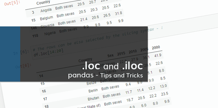
This notebook is a part of Pandas – Tips and Tricks mini-series, focusing on different aspects of pandas library in Python. In the below examples we will be looking at selecting the data by using .loc and .iloc methods. The notebook is also available on GitHub.

.loc: is primarily label based indexing.

.iloc: is primarily integer position based indexing.

Previous blog posts on the topic: Data import with Python, using pandas DataFrame – Part 1


Let’s start by importing pandas and loading the data:

In [1]:
# Loading the library
import pandas as pd

# I am using the data from WHO as an example
df = pd.read_csv('Data/SuicBoth.csv')

# Checking the DataFrame shape
print(df.shape)

# Checking the imported data
df.head()
(183, 6)
b4
Python,

Data visualization with Python and Matplotlib / Scatter Plot – Part 3

Let’s look at what else can be done with the data from Part 1. We start with the csv import mentioned in Part 2. Looking at the data we see that we have data available for 2010 and 2015 years, and we can analyze the change in suicide rates.

In [1]:
%matplotlib inline
import numpy as np
import pandas as pd
import matplotlib.pyplot as plt
import matplotlib as mpl
In [2]:
table = pd.read_excel('mergedData.xlsx')
table.head()
Out[2]:
Country 2015_s 2010_s 2015_p 2013_p 2010_p 2013_d suiAve suiPerDeath deaPerPop
0 Afghanistan 5.5 5.2 32526.6 30682.5 27962.2 7.7 5.35 0.694805 0.77
1 Albania 4.3 5.3 2896.7 2883.3 2901.9 9.4 4.80 0.510638 0.94
2 Algeria 3.1 3.4 39666.5 38186.1 36036.2 5.7 3.25 0.570175 0.57
3 Angola 20.5 20.7 25022.0 23448.2 21220.0 13.9 20.60 1.482014 1.39
4 Antigua and Barbuda 0.0 0.2 91.8 90.0 87.2 6.8 0.10 0.014706 0.68
b3
Python,

Data visualization with Python and Matplotlib – Part 2

In the previous chapter I described how to import the needed data to Pandas DataFrames, and how to manipulate DataFrame object. Now lets take a look on how we can visualize that data in a plot form. This is by no means a proper analysis of the suicide rates. It is a plotting example.
Below are the necessary imports. ‘%matplotlib inline’ is IPython-specific directive which displays matplotlib plots in notebook. It can be removed and plt.show() can be added to the end of the code to display the plot. We are also importing numpy, pandas, matplotlib.pyplot for plotting, and separately matplotlib to work on specific matplotlib functions if needed.

In [1]:
%matplotlib inline
import numpy as np
import pandas as pd
import matplotlib.pyplot as plt
import matplotlib as mpl

Next step is to import our data and assign it to DataFrame. We created that table in the previous example.

In [2]:
table = pd.read_excel('mergedData.xlsx')
table.head()
Out[2]:
Country 2015_s 2010_s 2015_p 2013_p 2010_p 2013_d suiAve suiPerDeath deaPerPop
0 Afghanistan 5.5 5.2 32526.6 30682.5 27962.2 7.7 5.35 0.694805 0.77
1 Albania 4.3 5.3 2896.7 2883.3 2901.9 9.4 4.80 0.510638 0.94
2 Algeria 3.1 3.4 39666.5 38186.1 36036.2 5.7 3.25 0.570175 0.57
3 Angola 20.5 20.7 25022.0 23448.2 21220.0 13.9 20.60 1.482014 1.39
4 Antigua and Barbuda 0.0 0.2 91.8 90.0 87.2 6.8 0.10 0.014706 0.68


b2
Python,

Data import with Python, using pandas DataFrame – Part 1

World Health Organization provides a wide range of data available for download in different formats.
The data is accessible through their website: http://www.who.int/gho/en/
In this example we will be working with Pandas DataFrame to organize the data. As an example I am going to work on suicide rates throughout the world.

In [1]:
import pandas as pd

By using ‘read_csv’ function, suicide crude rates (per 100,000 people) data is assigned to pandas object.

In [2]:
suicideData = pd.read_csv('SuicBoth.csv')
suicideData.head()
Out[2]:
Country Sex 2015 2010 2005 2000
0 Afghanistan Both sexes 5.5 5.2 5.4 4.8
1 Albania Both sexes 4.3 5.3 6.3 6.0
2 Algeria Both sexes 3.1 3.4 3.6 3.0
3 Angola Both sexes 20.5 20.7 20.0 18.4
4 Antigua and Barbuda Both sexes 0.0 0.2 1.6 2.3