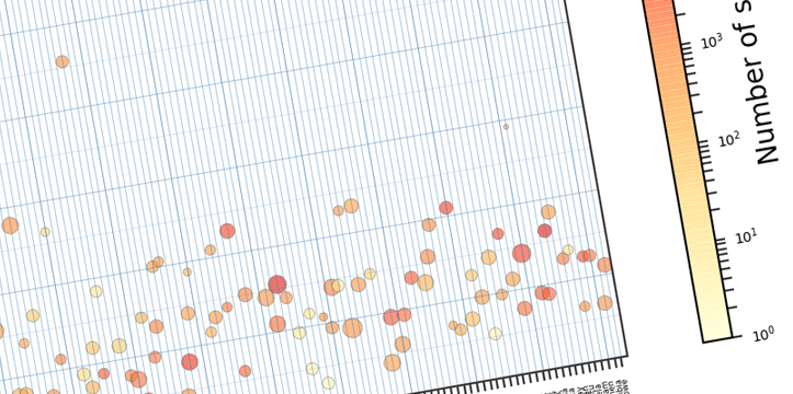
In the previous chapter I described how to import the needed data to Pandas DataFrames, and how to manipulate DataFrame object. Now lets take a look on how we can visualize that data in a plot form. This is by no means a proper analysis of the suicide rates. It is a plotting example.
Below are the necessary imports. ‘%matplotlib inline’ is IPython-specific directive which displays matplotlib plots in notebook. It can be removed and plt.show() can be added to the end of the code to display the plot. We are also importing numpy, pandas, matplotlib.pyplot for plotting, and separately matplotlib to work on specific matplotlib functions if needed.
%matplotlib inline
import numpy as np
import pandas as pd
import matplotlib.pyplot as plt
import matplotlib as mpl
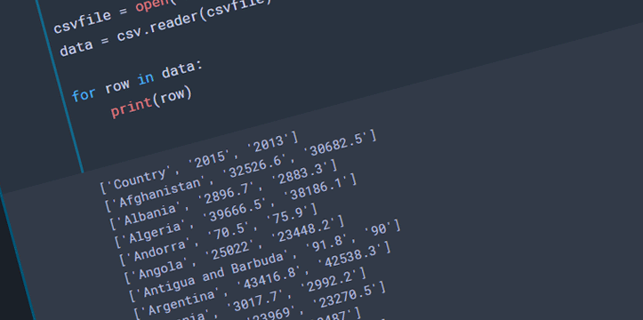
Next step is to import our data and assign it to DataFrame. We created that table in the previous example.
table = pd.read_excel('mergedData.xlsx')
table.head()


