b8
Machine Learning, Python,

k-NN Nearest Neighbor Classifier

Nearest Neighbor Classification

k-Nearest Neighbors (k-NN) is one of the simplest machine learning algorithms. Predictions for the new data points are done by closest data points in the training data set. The algorithm compares the Euclidean distances from the point of interest to the other data points to determine which class it belongs to. We can define the k-amount of the closest data points for the algorithm calculations.

Lower k results in low bias / high variance. As k grows, the method becomes less flexible, and decision boundary close to linear. Higher k results in high bias / low variance.

Few links on the topic:

Also, this blog post is available as a jupyter notebook on GitHub.

b7
Machine Learning, Python,

Machine Learning – Programming Exercise 1: Linear Regression

Programming Exercise 1: Linear Regression

I started working on the Machine Learning course by Andrew Ng. The following blog post contains exercise solution for linear regression using gradient descent algorithm. Also, this blog post is available as a jupyter notebook on GitHub.

This exercise was done using Numpy library functions. I also used scikit-learn library to demonstrate another way of linear regression plotting.

In [1]:
# Standard imports. Importing seaborn for styling.
%matplotlib inline
import numpy as np
import matplotlib.pyplot as plt
import seaborn; seaborn.set_style("whitegrid")
b6
d3,

Map Visualization Using D3.js; New Mexico

In the previous blog post I showed few examples of data visualization using D3.js. There were multiple examples of choropleth maps, summarizing population, population change, and employment rates data. In this blog post I will try to show step by step guide on how to create similar maps. As an example I am working on New Mexico population data by county. The data was obtained through US Census Bureau, and is available to download straight from their website. The files used in this example are provided at the end of this blog post. Also I’d like to suggest Mike Bostock’s Choropleth example as a guide to mapping. Topojson file creation from Shapefile is not shown in this tutorial. I might write a separate blog post on that topic.

b5
d3,

d3.js Data Visualization; New Mexico

Visualization is the key to understanding the data. Lines of endless data can be overwhelming. Most of the times, to reach the conclusion, it is better to visualize the task. D3.js is a JavaScript library that is used for data visualization using the web standards like HTML, CSS, and SVG. Since the initial release in 2011, D3 gained popularity pretty quickly due to dynamic, interactive data visualizations capabilities in the browser. There is a huge community of followers of D3, and it is supported and improved by its creator Mike Bostock constantly.

Lately I’ve been working on D3. There is definitely a lot to learn, a lot to gain and improve. This blog post is a quick summary of knowledge that I gained in the last few weeks playing with D3. Initially I started looking for tutorials, and books on the subject. To be honest I’ve got a bit frustrated due to the lack of detailed material on the subject. I found “D3.js Essential Training for Data Scientists” on Lynda.com that guided me in the right direction. I discovered for myself https://bl.ocks.org/, and since then I started checking different types of visualization provided on that website. My way of learning is to think about a problem/case that might interest me, see if there is any solution available, if not then divide the problem into smaller tasks, and work on them one by one.

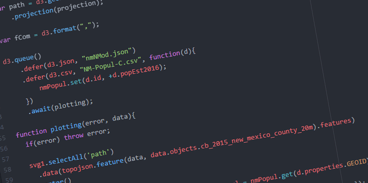
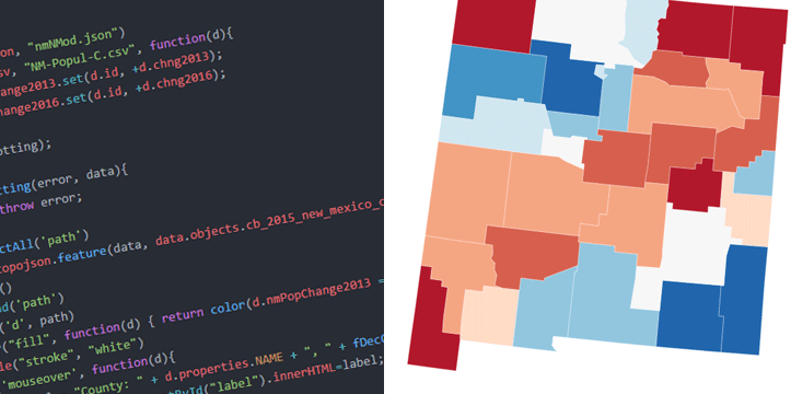
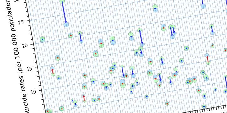
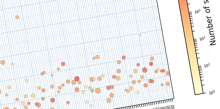
Let’s look at few examples below. I am working on New Mexico data for this blog post. The data was gathered through US Census Bureau, and US Department of Labor websites. Disclaimer: this is not a complete analysis of the data; data is used for visualization purposes only, all the data is available for public on the above mentioned websites. I will be working on a few tutorials in the next few weeks, explaining the below examples in bigger detail.

b4
Python,

Data visualization with Python and Matplotlib / Scatter Plot – Part 3

Let’s look at what else can be done with the data from Part 1. We start with the csv import mentioned in Part 2. Looking at the data we see that we have data available for 2010 and 2015 years, and we can analyze the change in suicide rates.

In [1]:
%matplotlib inline
import numpy as np
import pandas as pd
import matplotlib.pyplot as plt
import matplotlib as mpl
In [2]:
table = pd.read_excel('mergedData.xlsx')
table.head()
Out[2]:
Country 2015_s 2010_s 2015_p 2013_p 2010_p 2013_d suiAve suiPerDeath deaPerPop
0 Afghanistan 5.5 5.2 32526.6 30682.5 27962.2 7.7 5.35 0.694805 0.77
1 Albania 4.3 5.3 2896.7 2883.3 2901.9 9.4 4.80 0.510638 0.94
2 Algeria 3.1 3.4 39666.5 38186.1 36036.2 5.7 3.25 0.570175 0.57
3 Angola 20.5 20.7 25022.0 23448.2 21220.0 13.9 20.60 1.482014 1.39
4 Antigua and Barbuda 0.0 0.2 91.8 90.0 87.2 6.8 0.10 0.014706 0.68
b3
Python,

Data visualization with Python and Matplotlib – Part 2

In the previous chapter I described how to import the needed data to Pandas DataFrames, and how to manipulate DataFrame object. Now lets take a look on how we can visualize that data in a plot form. This is by no means a proper analysis of the suicide rates. It is a plotting example.
Below are the necessary imports. ‘%matplotlib inline’ is IPython-specific directive which displays matplotlib plots in notebook. It can be removed and plt.show() can be added to the end of the code to display the plot. We are also importing numpy, pandas, matplotlib.pyplot for plotting, and separately matplotlib to work on specific matplotlib functions if needed.

In [1]:
%matplotlib inline
import numpy as np
import pandas as pd
import matplotlib.pyplot as plt
import matplotlib as mpl

Next step is to import our data and assign it to DataFrame. We created that table in the previous example.

In [2]:
table = pd.read_excel('mergedData.xlsx')
table.head()
Out[2]:
Country 2015_s 2010_s 2015_p 2013_p 2010_p 2013_d suiAve suiPerDeath deaPerPop
0 Afghanistan 5.5 5.2 32526.6 30682.5 27962.2 7.7 5.35 0.694805 0.77
1 Albania 4.3 5.3 2896.7 2883.3 2901.9 9.4 4.80 0.510638 0.94
2 Algeria 3.1 3.4 39666.5 38186.1 36036.2 5.7 3.25 0.570175 0.57
3 Angola 20.5 20.7 25022.0 23448.2 21220.0 13.9 20.60 1.482014 1.39
4 Antigua and Barbuda 0.0 0.2 91.8 90.0 87.2 6.8 0.10 0.014706 0.68


b2
Python,

Data import with Python, using pandas DataFrame – Part 1

World Health Organization provides a wide range of data available for download in different formats.
The data is accessible through their website: http://www.who.int/gho/en/
In this example we will be working with Pandas DataFrame to organize the data. As an example I am going to work on suicide rates throughout the world.

In [1]:
import pandas as pd

By using ‘read_csv’ function, suicide crude rates (per 100,000 people) data is assigned to pandas object.

In [2]:
suicideData = pd.read_csv('SuicBoth.csv')
suicideData.head()
Out[2]:
Country Sex 2015 2010 2005 2000
0 Afghanistan Both sexes 5.5 5.2 5.4 4.8
1 Albania Both sexes 4.3 5.3 6.3 6.0
2 Algeria Both sexes 3.1 3.4 3.6 3.0
3 Angola Both sexes 20.5 20.7 20.0 18.4
4 Antigua and Barbuda Both sexes 0.0 0.2 1.6 2.3
b1
Python,

Importing CSV data in Python

One of the purposes of this blog, as it is stated in the About page, is to share useful information while I am practicing to code. I think it is also a good habit to have posts like this one to refresh my own memory. Data comes in many forms (including CSV – Comma-separated values), and it needs to be imported for further manipulations and analyses.